
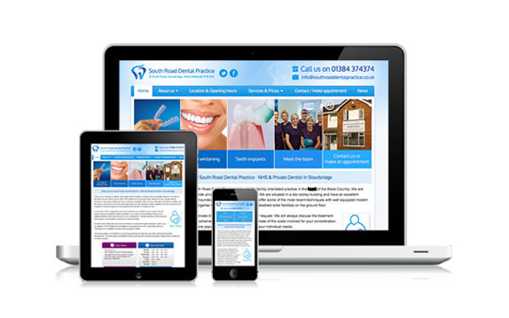
If you are creating a mobile-friendly website, you should consider building a responsive website design, which is one of three recommended options by Google.
Google supports three different configurations for creating smartphone-optimized websites:
- Responsive design: serves the same HTML for one URL and uses CSS media queries to determine how the content is rendered on the client side. This removes the possible glitches of user-agent detection and frees users from redirects. This is Google’s recommended configuration.
- Dynamic serving: serves different HTML for one URL depending on the user-agent. Use the Vary HTTP header to indicate you’re doing this.
- Separate mobile site: redirects users to a different URL depending on the user-agent. Use bidirectional link annotations to indicate the relationship between the two URLs for search engines.
Read the benefits of a responsive design website:
- Time-saving – if your website uses a content management system (CMS) such as WordPress, you will only need to update information once, whereas with separate mobile and desktop sites you would need to carry out the changes twice.
- Search Engine Optimization – it leads to a more holistic online marketing approach for all the traffic to your site is registered to one website rather than multiple ones. If you have a bilingual site, it also helps your Spanish SEO.
- Additional Features – your company can leverage on in-built technology features such as such as cameras and geolocation GPS to enhance the mobile user’s experience even more
- Seamless User Experience – your responsive website design will deliver an integrated user experience, regardless of device and screen resolutions.
- SEO & PPC Benefits – Google’s help page on “Building Smartphone-Optimized Websites” recommends a responsive web design above other approaches.
- Simplified Analytics and Reporting – having a single set of analytics to examine and report can make it easier to analyze conversion paths and funnels helpful for improvements and optimize conversion rates
- Common Code Base – any changes and edits can be made in just one place and seen by all visitors to the site across all devices, reducing the associated costs and time to update the website.
- Higher Conversion Rates – by focusing on smartphone and tablet users while still addressing desktop users, the overall conversion rate for your site will likely increase and your bounce rate decrease as users spend more time on your site.
Where to start?
Enter your site on this tool www.responsinator.com to learn how measure the responsiveness of your website. Then, contact Hispanic Market Advisors® to discuss how we can help improve your websites become more smartphone-optimized websites. If you have already your site optimized for mobile and simply need to get your English to Spanish website translation, please contact us as well.

