Why You Need Responsive Email Communications When Reaching Latinos
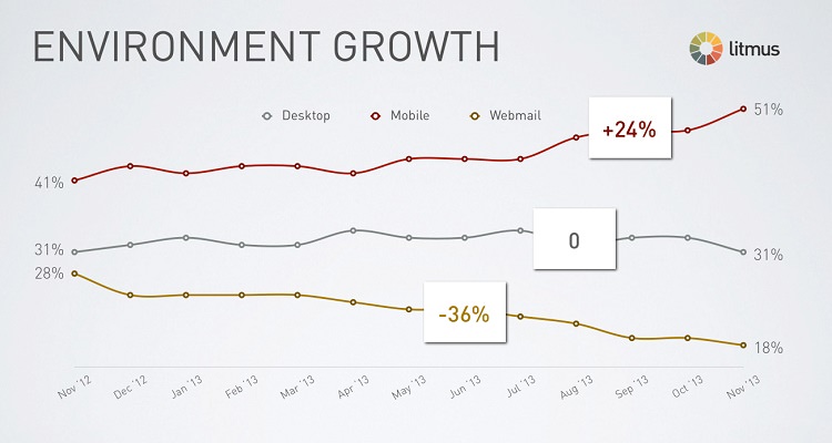
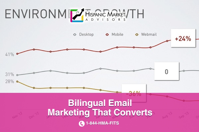
- 51% of email opens are on mobile devices, conyet many emails are only designed for desktop viewing
- 35% of business professionals check email on a mobile device
- 80% of people delete an email if it doesn’t look good on their mobile device
- 150 times a day: People look at their phones an average of 150 times a day
Why using responsive or mobile-friendly design in your email communications?
With a very high open rate (up to 85%) in mobile devices, there has been a big push by digital marketers to use responsive or mobile-friendly design in their email communications with their contacts and subscribers. This is especially true for brands wanting to connect and engage with Latino community because Latinos over index in mobile usage, and time spent on mobile devices. Constant Contact found that using responsive design increases clicks 15%, while using Litmus email testing increased clicks 13–24%. Furthermore, some studies show that when responsive design A/B testing is used, responsive email can even bring up to 130% increase in clicks which in turn helps increase sales-ready leads.

Hispanic Market Advisors® helps you build, design, test, and analyze your emails.
From the results above, it’s obvious that optimizing your emails for mobile is a win-win — your subscribers will receive your emails in the format they want and you’ll get better results.
Get in touch with us, and then decide.
Hispanic Market Advisors helps you connect with the online Latino market and expand your reach.
Hispanic Market Advisors Uses Constant Contact as the Preferred Partner for Email Marketing
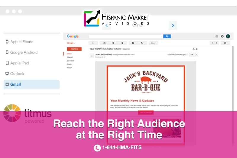
Among many of the great features, we like to use the “Inbox Preview” to see how your campaigns display in the most popular email clients.
Take a peek at the image below to get an idea.

With this Inbox Preview feature, you can instantly preview your campaigns before sending. In just one click, you’ll get Email Previews, powered by Litmus, in iPhone 6s, iPad, Android, Gmail, and Outlook 2013 (up to 5 tests).
US Hispanics own more smartphones and goes online more from a mobile device
Latino internet users are more likely than other groups to go online using a mobile device—76% versus 60%. Source: a “Pew Research Center” study – check here.
Infographics: quick facts all brands planning Latino Marketing initiatives must know
Where does this take us?
Website design and mobile are two of the fastest changing technologies in digital marketing, besides search engine optimization. As the world becomes increasingly more mobile, there’s an overall trend towards opening email on mobile devices for the first time. Those mobile users subscribers often open eblasts and enews from the companies and preferred brands they have opted-in. These types of email communications include event announcements, products or services launches, special offers and promotions, monthly or quarterly newsletters, and the list goes on.
Internet and search engine marketers need to focus not only on creating the most compelling content possible to engage their subscribers and target audience but also doing so in an email design that looks good across all platforms. For this reason, responsive design is no longer a luxury for email marketers – it’s a necessity. Contact Hispanic Market Advisors for responsive email design and email marketing, and ensure your emails render beautifully across all mobile devices.
Check also our responsive website design services and Mobile Marketing to Latinos.


